Thursday, August 21, 2014

Notebook-sightings in "The Story of Math" and "The Beauty of Diagrams"

A beautiful green diary belonging to German mathematician Carl Friedrich Gauss, a child prodigy who grew to make important contributions to numerous mathematical fields.  Among the notations in his diary are reportedly "I've made this wonderful discovery, and incidentally a son was born today".


The notebook of Hungarian mathematician Janos Bolyai, who made important contributions to non-Euclidean geometry.  Unfortunately, not only did Gauss refuse to tutor the prodigy, leading him to join the army instead, but he also later found that another mathematician had independently discovered his theorems and published first, leading him to die in relative obscurity.


Handwritten pages from Copernicus's manuscript on the revolution of planets:


Written pages from my idol Isaac Newton.


Manila File Paper review

Buff (traditional, manila-file color) and white are the only manila file paper colors that are really conducive to writing. 

Introduction


Earlier this summer, I began using Manila File cover-weight paper for my index cards.  I also became very interested in the text-weight paper from the same brand, which seemed like a potential replacement for Tomoe River paper in my Levenger Circa notebook.  (Tomoe River's light weight means it slips out of Circa rings rather easily.)  Although I ultimately did not choose to use the text weight paper, I thought it might be of interest to others.  It certainly beat out other non-Tomoe printing paper I had used in the past, like HP 32-lb paper or Double A paper, in terms of fountain-pen friendliness.  The cover-weight paper, however, has been adopted as my preferred index card paper.

Previously used cards -- Moleskine & Exacompta


Prior to Manila File paper, I had been using Exacompta and Moleskine index cards, but had never been completely satisfied. Exacompta was very fountain-pen friendly but I could only ever find it in the four-pastel-color grid options, although it was supposed to be available in white as well. Moleskine cards were beautiful but expensive.  A pack of 20 cards cost $8 on Amazon, and I only ever used half-a-pack, the square-ruled cards, because I disliked the vertical orientation of the lined half.  Finally, the coating on Moleskine cards repelled my everyday ink, Noodler's bad-black moccasin, so I had to keep a separate pen inked up with a different black ink just for writing on index cards. So earlier this summer I began to seriously look into manufacturing my own index cards, and Manila File cardstock won out amongst various brands I sampled.


About Manila File Paper


Manila File paper is recycled paper.  It comes in only two weights: a 70T text weight and an 80C cover weight. It comes in a variety of attractive, vintage-looking colors, but only two colors are suitable for writing: the white color, and a traditional manila-file color called buff.  Buff does not look as luxurious as other cremes and ivories, and I ultimately decided not to go with buff-colored cards, even though I initially set out to find a creme-colored card. 


Manila file paper is available in vintage colors.
My fine-to-medium nibs laid down extremely smooth and wet lines on both the text weight and cover weight paper, although the text weight was much smoother.  There is quite a bit of show-through on the text-weight paper, but no bleed-through. There is of course no show-through on the cover-weight cardstock, unless you hold a single card up in front of a light source.

Both the text weight and card paper have a rather long drying time.  You must be very careful to blot a card before turning it over. However, I believe the Manila File text-weight paper has a slightly better drying time that Tomoe. By the time I get to a 5th line of text, the first four are basically dry, except for the periods at the ends of sentences and the dots on top of the i's and j's.  If I press another paper to the text to test for transfer, only the afore-mentioned dots and the last two or three words I wrote transfer over.  I write mostly with fine-to-medium nibs so I'm not sure how well this holds up with broader nibs. 


Manila File 70T paper, front

No bleed through on back of 70T paper
In Summary ...

Overall, I have been satisfied with Manila File paper and hope others will be as well. Although I decided to go with white Manila File cardstock for my index cards, I eventually decided against using the text-weight paper because I miss the softness of paper that is intended for writing.


I now offer Manila File Folder index cads on my Etsy Store. The cards 3.5" x 5.5" are available for $7.49 for a 50-pack of lined or squared cards.  The text-weight paper, for anyone who is interested, is available at the Paper Mill Store. 

Sunday, July 20, 2014

Printing your own stationery


Partner in crime - My Epson WorkForce 645 used waterproof ink.


It makes sense that picky fountain pen users who put time and effort into selecting just the right pen, ink, and nibs, also take the additional step of creating their own stationery, with their paper of choice, formatted as they like it, rulings and all, if no satisfactory stationery already exists.

Here are a few useful tools and services for printing your own stationery.


Sunday, June 29, 2014

My journey in search of the perfect pen/paper/ink combo


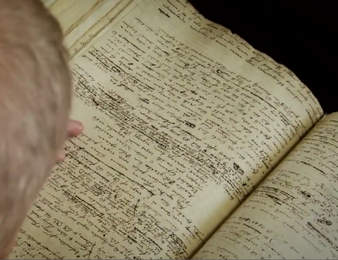
Three types of notebooks I use: a "project notebook" (large), journal (medium), and pocket notebook that I stitch myself from Tomoe River paper.

Someone on the Fountain Pen Network began a forum thread asking users about what features would comprise their perfect notebook. My response quickly became too long, so I turned it into a blog entry.

There is no notebook that is perfect for everyone.  Being a fountain pen user makes one impossibly picky -- my search for the perfect notebook would have been brief had I been satisfied with gel pens.  As a fountain pen user, however, you look for fountain-pen-friendly features: limited show-through; the absence of bleed-through,  feathering, and loss of shading; nibs that don't skip and inks that aren't dry; basically, an experience in which you can lay down smooth wet lines that are true to the color of your ink.

In addition to a fountain-pen-friendly writing experience, I also look for functional design in my books. The book has to properly fit the purpose for which it is designed: a diary into which I pour my deepest reflections; a pocket notebook into which I jot down quick thoughts and lists on the go; a notebook for my grad school course work, my regular paying work as a research assistant,  and notes from work meetings; and an agenda for my schedule and tasks.  These requirements mean attention to size, ruling, flexibility, and so forth.

If I were an efficient human being who did not have an unhealthy notebook fetish, I would own only two or three notebooks: a single circa notebook could meet all my academic and work needs, a diary, and a pocket notebook.  I currently use the first section of a letter-sized circa as my agenda, but if I didn't, I might also want a small portable agenda.

However, I am not an efficient human being with common sense.  I have a notebook fetish, and insist on using saddle-stitch and hard-bound notebooks simply because I find them charming, knowing full-well that all these things would be better contained in a circa along with my lecture notes.  But they're not. Because I like notebooks and I insist on actually using them for more than journaling.

So instead I use five distinct types of notebooks for five distinct purposes.

The features I prefer in the kinds of notebook I use are as follows. (Disclaimer: I sell Tomoe pocket notebooks and paper, so it may come as biased that I ended up using mostly this paper, but I basically invested in it because I grew to use it for most things, and not vice versa).

Friday, June 7, 2013

What features would my dream notebook have?

My dream A4 grid notebook does not exist.  If it did, these are the features it would have: 

Paper that permits saturated color & smooth, thin lines. No spread, bleed-through, or loss of shading... even at the cost of long drying time & low level prone-ness to picking up oily fingerprints (have learned to avoid those).

Letter width + longer than A4 height... i.e. L1917's "master size" .... space for generous Cornell-style margins + more information on the page.

5 mm dot grid, in light grey. Grids are unobtrusive while every bit as functional as lined or grid. Narrow ruling means more info on a page using an EF nib.

No margin. I like making my own, usually 2".  Have also experimented with Medieval layouts; lack of pre-drawn margins helps with that.

200+ pages.  Have actually run out of pages in a 230 page notebook for a class that stretched over 2 semesters.  For some projects, I like to start a related but different project in the same book.

Off white, but light-colored. Brings out contrast with black ink.

Table of Contents and page numbering. Aids mightily with organization.

Index? Not sure. Have used this with only pocket notebooks, where I wanted to remember where I noted something on a particular topic.

Perforated pages at the back: for testing ink, and, well, for ripping something out if necessary one day.

Ribbon. Useful. Maybe even 2, like the Seigel Conceptum notebooks have.

Sturdy strap.

Black leatherette cover.  Leather covers are for journals. My notebooks are for various projects.

Rounded corners. Aesthetically pleasing.

Back pocket, large enough to contain letter-sized sheets: useful for handouts.

Labels: "classic" feel for front of notebooks. (I prefer Dymo embossed labels for spine of book though.)

Wednesday, February 27, 2013

Review: Kokuyo Campus Todai A4

The Kokuyo Campus Todai A4 held up well after a year of use.
 The unique feature of the Kokuyo Campus "Todai" series is that its horizontal lines are marked with equally spaced dots, so that a page appears to be a regular, lined page but is as functional as a grid and can be used for science and math.

This particular A4 Todai series contains 40 sheets (80 pages) of off-white paper with a slight ivory tint. Glued binding or spiral binding varieties are available, as are 6mm ruled (blue cover) or 7 mm ruled (orange cover).  Looseleaf varieties are also produced, but the quality of paper in the looseleaf A4 size is of different and lower quality than the bound version. The looseleaf A4 is more dry and has more loss of shading than the bound version.  B5 sizes of all varieties are also available in a larger variety of colors; bound B5 seem to contain the same quality of paper as the A4 books, but the quality of looseleaf B5 paper is unknown. The Japanese company site also advertises A4 and B5 notepads, but Jetpens does not carry them. All Todai series books are paperback/softcover.

Smooth, wet writing comes at a cost of long drying time.
Small dots make the lined notebook as functional as a grid.
The book was used extensively as an exercise book for a class.  It held up well under a year of use.  Writing in the book was smooth and wet. There was a very slight loss of shading: ink color stays very faithful but most colors have little sheen.  It is smooth, but more textured than brands like Rhodia or ClaireFontaine.  As usual, smooth wet writing with little loss of shading comes at the cost of drying time, and a blotting sheet might be necessary to speed up drying and prevent transfer to the facing page. One rare occasions, it can pick up oily footprints, but this can be avoided by always using clean hands.   There was minimal see through and never any bleed-through observed through the use of multiple inks, including some that were prone to bleed-through other papers.